Brand Usage & Guidelines
Introduction
Welcome to the brand identity guidelines for MoMo partners. We take pride in the quality of our work. If you have been granted the right to use our assets (logo, icons), please follow these principles to ensure the brand always appears at its best.
Using Our Logo
In addition to the rules below, please refer to our Logo & Practice Guides section when you need to display the MoMo Payment method on your website/app.
The Primary Logo
For branding purpose
The official MoMo logo is composed of the two words “Mo” + “Mo” symmetrically placed together. This is a core identifier and must appear on all MoMo promotional materials and advertising assets.
 |  |
|---|---|
| Logo on light pink background | Logo on image backgrounds |
 |  |
|---|---|
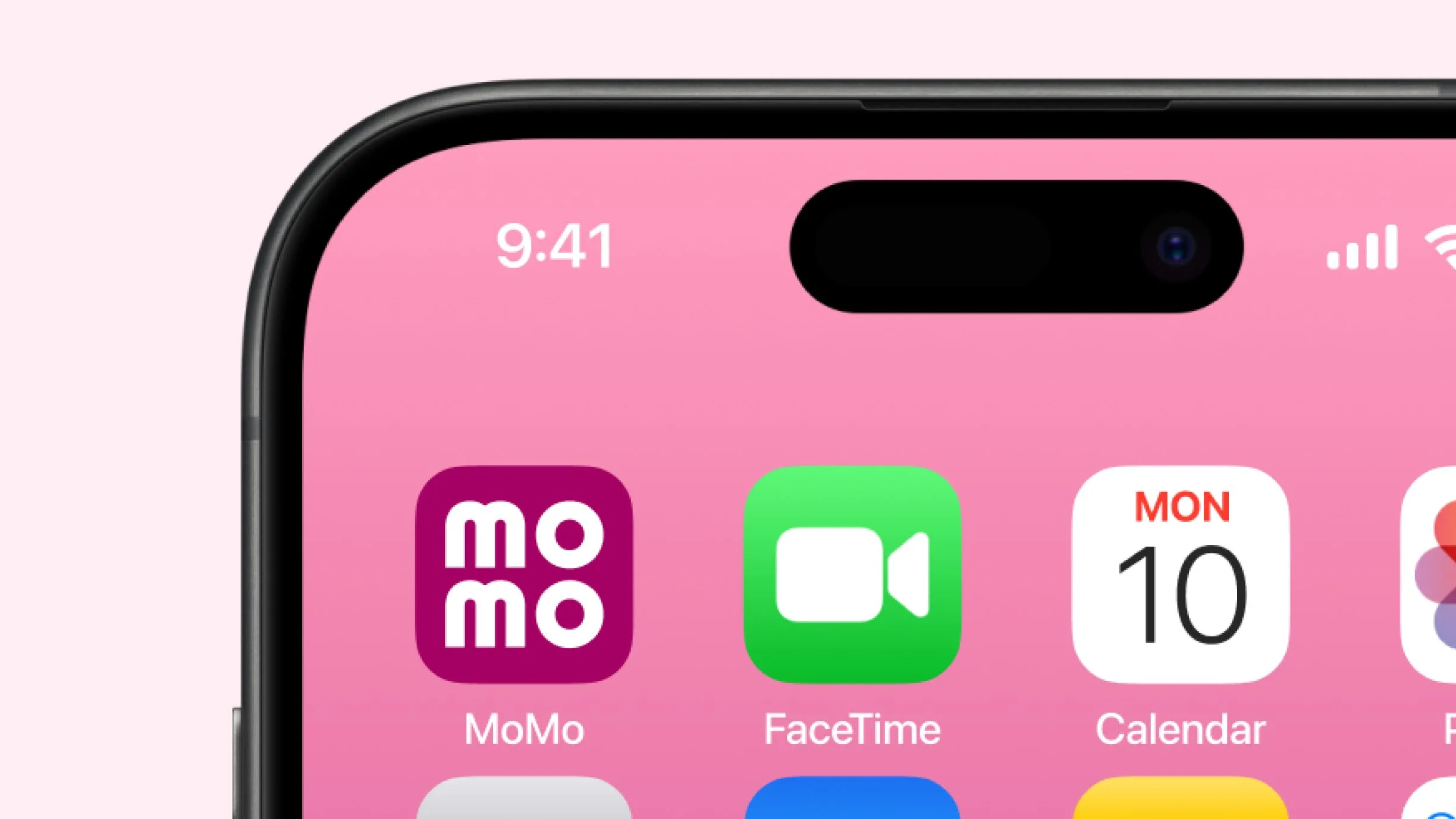
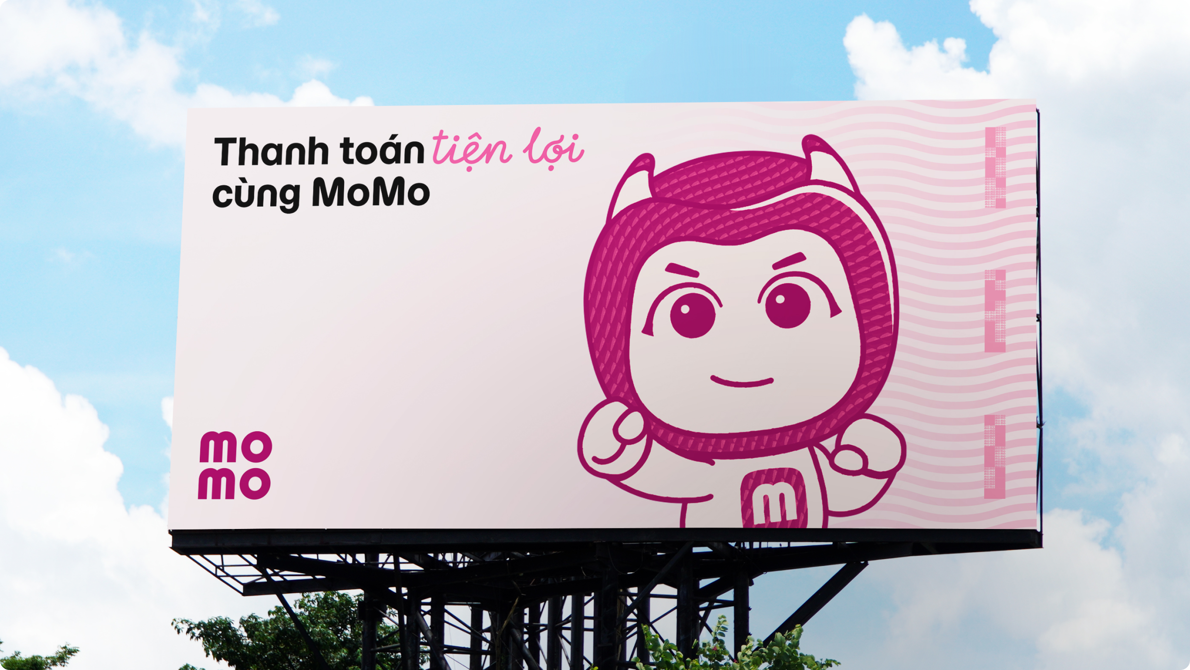
| Logo on app icon | Logo on outdoor billboards |
For your checkout/payment setting page
In most cases, you'll need to use the MoMo logo in a checkbox selection for payment methods on your website/app. In this case, the Primary logo should be displayed on MoMo’s signature pink background and placed within the standard logo frame and safe zone designated for digital interfaces.
If the standard logo does not fit your layout, you may use the transparent background version. For special cases, please contact our support team for guidance.
 | |
|---|---|
| Primary logo on app icon | Transparent background logo |
Download Primary logo on app icon
Download Transparent background logo
Logo Variants
The monotone logo
The monochrome logo is used to indicate the MoMo payment method is temporarily unavailable (e.g., the user hasn’t binded their MoMo account or hasn’t chosen it previously). You may only use the monochrome version with explicit permission from MoMo.

Monotone logo
Download the monotone logo
Minimum Size Requirements
To maintain clarity and detail, please ensure the logo and icon are not scaled to the following parameters:
- Print: Logo should be no smaller than 10mm in height.
- Digital Platforms: Logo should be no smaller than 30px in height.

Common Mistakes
Below are some examples of what must be strictly avoided when using the MoMo logo.
 |  |  |
|---|---|---|
| Do not use outdated logo with wordmark | Do not place the logo within an unapproved frame | Do not add shadow effects to the logo |
 |  |  |
|---|---|---|
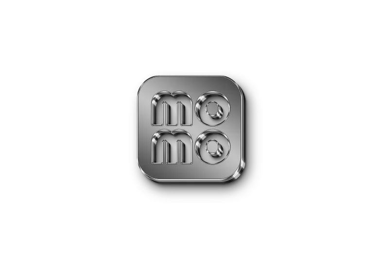
| Do not add illustrations or patterns over the logo | Do not change the structure or layout of the logo | Do not use the outline-only version of the logo |
 |  |  |
|---|---|---|
| Do not stretch, distort, or skew the logo | Do not add an embossed effect to the logo | Do not add textures or 3D effects to the logo |
 |  |  |
|---|---|---|
| Do not use incorrect colors for the logo | Do not use incorrect color combinations between the logo and the background | Do not change the brightness or darkness of the logo |
Legal Regulations
You are required to comply with all the above guidelines when using or displaying MoMo’s brand assets (logo, icons). By using our brand, you agree to these rules. Any violation may result in the automatic termination of your license or right to use our brand assets.
MoMo will review your usage of the logo on your website/app before approving the go-live of the integrated payment solution.